11 by 14 Prints Made Simple for Cat Art Walls

You've got a cat photo or cat illustration you adore. It looked perfect on your phone, your desktop, maybe even as your wallpaper. Then you go to order a print and suddenly the questions start shedding all over the place. Is 11 by 14 just a bigger 8 by 10? Why does the preview crop off one ear? Do you need an 11 by 14 frame, or is everyone secretly putting these into something bigger and fancier?
That confusion is normal. Cat art buyers usually aren't struggling with taste. You already know which sleepy loaf, judgmental tuxie, or regal longhair deserves wall space. The trouble is that 11 by 14 prints sit in a sneaky middle zone. They're large enough to feel intentional, but still compact enough for apartments, gallery walls, desks, gifts, and cozy corners.
Floofie would like it known that this is prime “excellent wall nap vibe” territory 😺
Introduction to 11 by 14 Prints for Cat Lovers
You're picking out wall art for the spot above the sofa. The cat portrait looks perfect on your phone. Then the print preview trims a whisker, the frame options multiply like kittens, and suddenly one simple question turns into two. Will your photo fit a true 11 by 14 shape, and should you frame the print itself or choose a matted size like 16 by 20 or 14 by 18?
Those are the sticking points for cat art buyers. An 11 by 14 print feels roomy enough to show off fluffy cheeks, bright eyes, and tiny toe beans, but it also sits in a slightly tricky middle ground. It is large enough to look intentional on the wall and still manageable for apartments, gallery groupings, gifts, or that reading nook your cat already claims as office property.
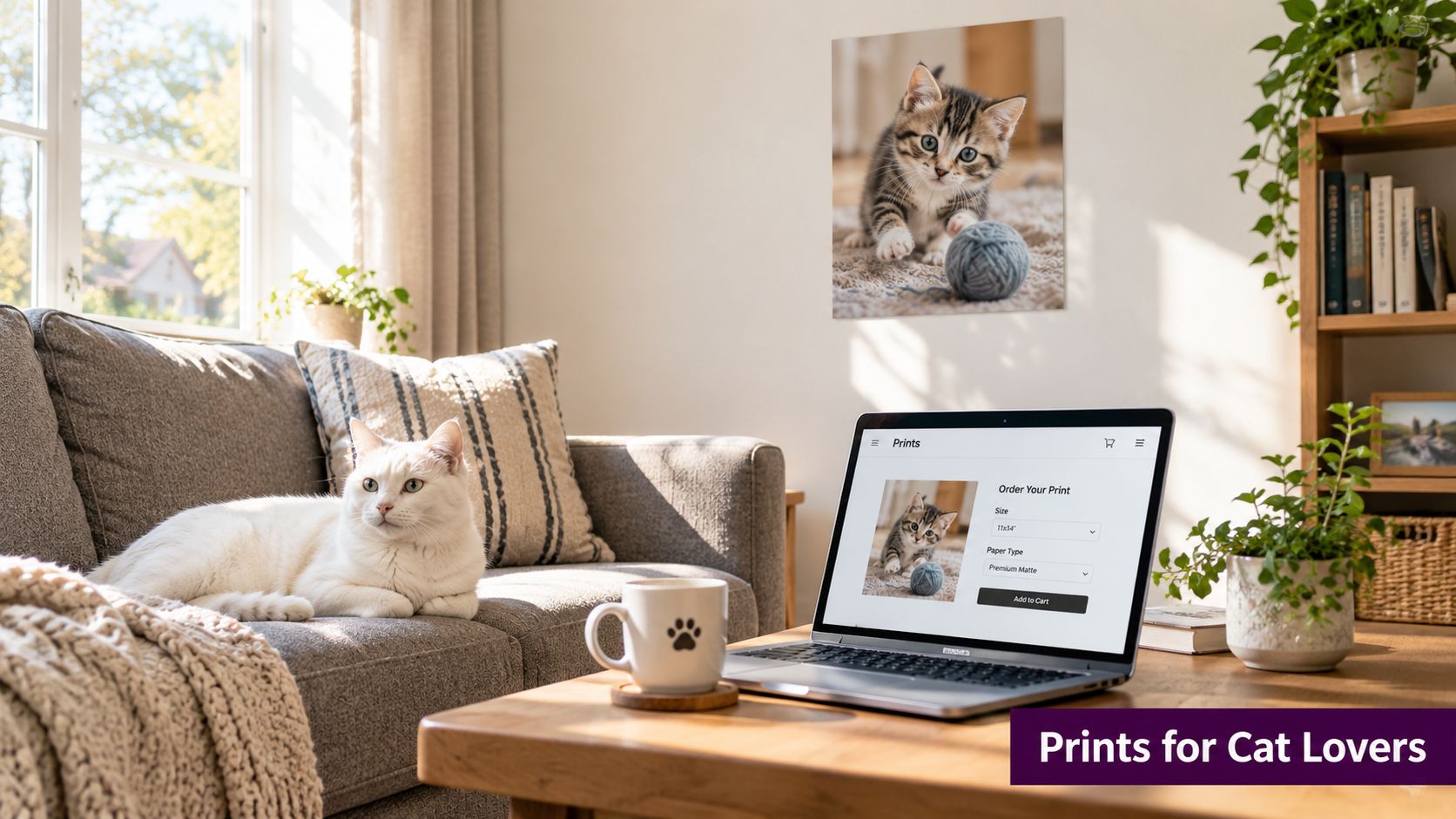
The important part is that 11 by 14 prints are not just “make it bigger” versions of whatever photo you started with. A phone photo often uses a 2:3 shape. An 11 by 14 print uses a different shape, so something may need to be cropped unless the image was prepared for that size. FloofChonk-style cat art makes this easy to spot. A close-up loaf portrait may crop beautifully, while a full-body sprawled-on-the-chaise masterpiece may need more breathing room so no tail tip gets sacrificed to the print gods.
Framing creates the second layer of confusion. Some buyers want a bare 11 by 14 print in an 11 by 14 frame, which gives a clean, direct look. Others prefer the print matted inside a larger frame, often for a more polished gallery feel and a little visual space around the art. Both options work. The better choice depends on the room, the art style, and whether you want your noble tabby portrait to feel cozy, formal, or delightfully dramatic.
A simple rule helps. Print size and frame size are two separate choices.
If you are styling a full cat-loving corner instead of hanging one piece by itself, these cat-themed home decor ideas can help you match artwork, spacing, and room mood without turning your wall into visual catnip chaos.
What 11 by 14 Prints Are and Why Size Matters
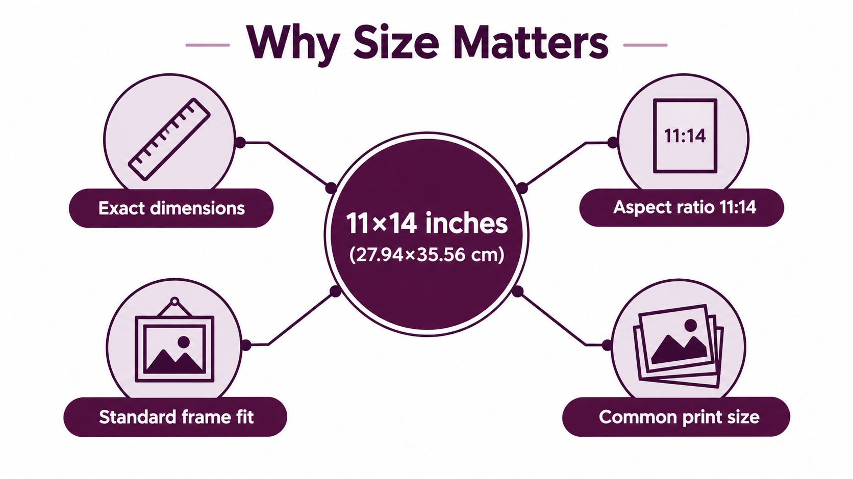
An 11 by 14 print measures 11 inches by 14 inches. In metric terms, that is 27.94 × 35.56 cm or 279.4 × 355.6 mm, as listed in Ready for Print's standard print size guide.
Simple measurement. Sneakier shape.
That second part matters more than many cat-art buyers expect. An 11 by 14 print has its own proportions, and those proportions affect how artwork sits on the wall, how much visual space a portrait gets, and whether a lounging FloofChonk looks pleasantly framed or a tiny bit squished.
The size is straightforward. The proportions do the real work.
An 11 by 14 print uses an 11:14 aspect ratio. If you turn that into a decimal, it comes out to about 1:1.27, which is why it does not line up neatly with several common photo shapes, as shown in Omni Calculator's aspect ratio tool.
Photo sizing works a lot like cat furniture. A wide windowsill, a square ottoman, and a tall cat tree can all hold the same cat, but the pose changes in each one. Your artwork behaves the same way. The subject stays the same. The frame shape changes how that subject fits, breathes, and grabs attention.
Why this size shows up so often in art prints
11 by 14 sits in a sweet middle range for wall art. It has enough presence to feel deliberate, but it usually fits spaces where a large poster would start bossing the room around like a confident orange tabby.
For cat art, that balance is especially useful. A detailed tuxedo portrait still reads clearly. A whimsical FloofChonk loaf illustration gets room to charm. A gift recipient can frame it without needing an oversized wall or custom furniture rearrangement.
It often works well for:
- A single featured piece over a desk, side table, or reading nook
- Shelf styling where the print leans behind smaller decor
- Giftable artwork that feels substantial without being awkward to place
- Gallery walls where one print needs enough visual weight to anchor smaller pieces
Size also affects framing decisions
This is the part many guides skip. “11 by 14” tells you the print size, not automatically the finished framed size.
A bare 11 by 14 print in an 11 by 14 frame gives you a cleaner, more direct presentation. It suits art that already has breathing room around the cat, such as a centered face portrait or a simple illustrated loaf pose.
The same print can also sit inside a mat and go into a larger frame, often 16 by 20 or sometimes 14 by 18 depending on the mat opening and the look you want. That version feels more formal and gallery-like. If your FloofChonk artwork has rich color, tiny fur details, or a stately “I own this house” expression, matting can help the piece feel more intentional.
Buyers often assume they are choosing one size. They are really choosing two. First, the art print. Then, the way that print will occupy wall space once it is framed.
It helps to compare prints and posters separately
Art prints and posters often get mixed together in shopping tabs, but they create different visual effects. If you want a broader size comparison, this guide to B2 poster size in cm and inches is useful because it shows how poster formats shift wall presence much more dramatically than a mid-size art print.
An 11 by 14 print works best when you treat it as a deliberate art format, not just “a medium rectangle.” That small shift in mindset saves a lot of cropping surprises, framing confusion, and lost tail-tip tragedies.
Aspect Ratio and Cropping Made Easy
You upload a favorite cat photo, the preview looks fine for one glorious second, and then the crop box nibbles off an ear. That little moment causes more 11 by 14 confusion than the print size itself.
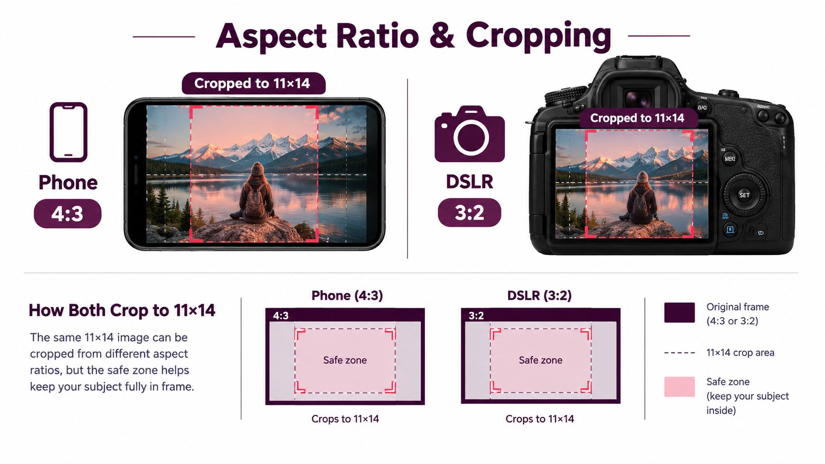
The reason is simple. 11 by 14 has its own shape. It uses an 11:14 aspect ratio, and that shape does not match several common photo formats such as 2:3, 4:5, or 3:4, as explained in Printique's aspect-ratio guide. If your original image was made in one of those formats, the printer usually has to trim part of the image to make it fit.
Why 2:3 photos cause the most trouble
This is the buyer question competitors often skip. A lot of phone and camera photos start as 2:3, which is a longer rectangle than 11:14. Put that wider photo into a slightly squarer print, and some image area gets cut.
Here is the easy way to picture it. A 2:3 photo works like a lounging cat stretched across the sofa. An 11 by 14 print is a tidier cat bed. The cat still fits, but the extra stretch at the edges has to go somewhere.
With a typical FloofChonk-style portrait, that usually means:
- Side trimming if the cat is centered in a wide horizontal photo.
- Top and bottom trimming if you rotate the image or push the composition vertically.
- Background loss even when the cat stays safe, which can change the feel of the art more than buyers expect.
That is why tails vanish first. Tails are drama queens.
Crop for the print you actually want
A smart habit is to make a dedicated 11 by 14 crop before you order instead of trusting the checkout tool to guess correctly. Auto-croppers are fine for simple snapshots. They are much less charming when your orange loaf's whiskers sit right on the edge.
Keep a small safety margin around anything you care about:
- Faces and ears need space around them.
- Names or captions should sit well inside the trim area.
- Paws, tails, and long whiskers should never kiss the border.
- Decorative backgrounds may need extra room if you plan to mat the print later and want the composition to feel balanced.
A helpful rule is to leave a quiet border around the subject, like the visual version of telling Floofie, “please do not sit on the keyboard for one minute.”
If a detail would make you sad to lose, do not place it near the edge of the crop.
Here's a useful visual explainer before you export your file:
File size and sharpness
For crisp printing, labs commonly recommend preparing files at 300 DPI. For an 11 by 14 print, that works out to 3300 × 4200 pixels, and Bello's print size guide gives a useful reference point for how print dimensions relate to pixel dimensions.
If your image is smaller, it may still print acceptably, especially for softer artwork styles. Fine fur detail, sharp eyes, and clean illustrated edges are the first places softness tends to show up.
Quick check before you order
Use this short checklist:
- Confirm the original photo shape. If it started as 2:3, expect a crop.
- Make the crop yourself. Save a version sized for 11 by 14.
- Check the edges at full view. Look for ears, whiskers, text, and tail tips.
- Zoom in once. If the eyes or fur already look soft on screen, printing larger will not fix that.
A good 11 by 14 crop feels calm and intentional. The cat stays whole, the composition keeps its balance, and no beloved tail tip gets sent into the void.
Resolution Paper and Finish Choices That Make Cat Art Pop
Once the crop is sorted, the next big decision is surface. Your print either whispers softly, glows warmly, or shouts “behold my glossy goblin child” from across the room.
The sharpness part is fairly simple. An 11 by 14 print typically needs enough image detail to hold up at print size, especially in fur, eyes, and delicate linework. That matters most with custom pet portraits, phone photos, watercolor cat art, and AI-generated images, where softness can sneak in.
Start with the room, not the paper sample
People often choose finish by habit. A better move is to think about where the cat art will live.
- Bright room with window glare often pairs better with matte or a softer luster look.
- Bold graphic cat art can look snappy on glossy or luster surfaces.
- Subtle watercolor or sketch-style portraits usually feel more natural on matte or fine-art paper.
- Busy family spaces benefit from finishes that don't turn every lamp reflection into a spotlight.
Paper and Finish Quick Picker for 11 by 14 Cat Prints
| Finish | Best For | Look and Feel | Watch Out For |
|---|---|---|---|
| Matte | Watercolor cats, gentle portraits, calm bedrooms | Soft, smooth, low-glare | Colors can feel less punchy in some artwork |
| Luster | Everyday wall art, mixed lighting, colorful pet portraits | Balanced color with mild sheen | Slight surface shine may still catch light |
| Glossy | High-contrast graphics, vibrant pop-art cats | Bold, shiny, saturated | Reflections and fingerprints can be more noticeable |
| Fine-art paper | Illustrations, painterly custom portraits, gift-worthy pieces | Textural, elevated, gallery-like | Texture can change the feel of very crisp graphic work |
Finish shortcut: If you don't want to think too hard, luster is often the “easy cat” option because it balances color and glare nicely.
Match the finish to the art style
A playful neon cat graphic and a sleepy ink sketch shouldn't always wear the same “coat.”
Try this matching approach:
- Graphic or meme-style cat art usually benefits from cleaner contrast and more visual snap.
- Vintage-inspired cat prints often look lovely on matte or textured stock.
- Detailed fur portraits do well on surfaces that keep fine contrast without too much glare.
- Nursery or soft pastel cat art tends to feel more relaxed on papers with a gentler finish.
If you're printing from a phone photo, check for over-sharpening too. Screens can make an image feel crisp when the detail is really just digital edge contrast. Prints are less forgiving. Floofie's ruling on this is simple: fluffy should look fluffy, not crunchy 😸
Matting and Framing Your 11 by 14 Prints Like a Pro
This is the second giant point of confusion for buyers. You've got the print. You know the crop works. Then framing advice starts contradicting itself like three cats trying to sit in one box.
Here's the clean answer. A no-mat 11 × 14 print fits directly into an 11 × 14 frame, while a matted display commonly uses a 16 × 20 frame, according to Framing Math's frame size calculator.
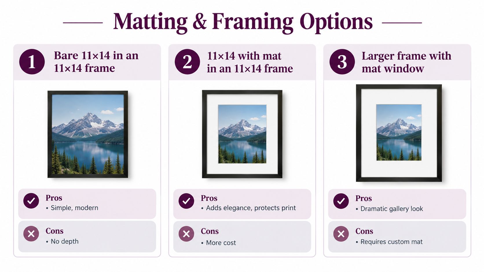
Option one with no mat
An 11 by 14 frame gives you the most direct fit. The print fills the opening. The result feels clean, simple, and modern.
This works especially well when:
- the artwork already has strong borders
- the style is graphic or minimalist
- the wall space is limited
- you want the least visual bulk
The tradeoff is presentation. Without a mat, the frame does all the visual work.
Option two with a gallery-style mat
Many buyers prefer an 11 by 14 print matted into a 16 × 20 frame. Framing guides note that this setup commonly uses a mat opening around 10.75 × 13.75 inches, with a visual border of roughly 2.5 inches on the sides and about 3.1 inches top and bottom, as outlined by Snap to Size's 11x14 mat guide.
That extra border changes the mood. The art gets breathing room. The piece looks more formal and more finished.
Where 14 by 18 fits in
The often-overlooked middle option is the 14 by 18 frame. A framing guide focused on 11 by 14 sizing notes that buyers often need more help choosing between a bare 11 by 14 print, a matted 16 by 20 presentation, or a tighter 14 by 18 alternative because decision is about borders, wall fit, and presentation style, not just “matching” the print to a frame, as discussed in Snap to Size's print-size-for-frame guide.
That 14 by 18 route is useful when you want some mat presence without the larger gallery footprint of 16 by 20.
The frame question isn't really “What size matches?” It's “How much breathing room do I want around the art?”
A quick side-by-side decision guide
| Framing choice | Best mood | Good for | Main compromise |
|---|---|---|---|
| 11 by 14 with no mat | Clean and direct | Small walls, shelves, modern rooms | Less depth and ceremony |
| 14 by 18 with mat | Balanced and tidy | Apartments, gifts, compact gallery walls | Less dramatic than a larger presentation |
| 16 by 20 with 11 by 14 opening | Gallery-style and polished | Statement placement, refined decor, feature gifting | Takes more wall space |
If you want extra reading on how matting changes presentation and protection, these Colorado Art Services matting tips are useful. And if you're shopping specifically around this format, this guide to an 11 by 14 frame can help you compare the display styles visually.
Display Ideas and FloofChonk Favorites for Every Room
11 by 14 prints are wonderfully flexible. They can act like a solo star, a supporting actor in a gallery wall, or the finishing touch in a tiny nook that needed one more dose of cat energy.
Bedroom and reading corner ideas
A single 11 by 14 cat portrait works beautifully in cozy spaces because it feels substantial without getting bossy. Over a nightstand, beside a book ledge, or above a reading chair, it brings personality without turning the room into a full-on cat museum. Unless that's your goal. In that case, I support your vision completely 🐾
For calmer rooms, softer art styles tend to feel most at home. Think sleepy cats, stretch poses, line drawings, or muted watercolor pieces.
Home office and desk styling
This size also shines near a workspace. It's large enough to enjoy while seated, but it won't eat the whole wall behind your monitor.
Try these combos:
- One framed print above the desk for a clean focal point
- A pair of related cat prints on a narrow wall to create symmetry
- A leaned frame on a shelf mixed with books, a mug, and one small plant that your real cat is probably already plotting against
A mid-size print often feels more personal in a workspace than a giant wall piece. It invites a smile instead of demanding attention.
Gifting and small gallery walls
For gifting, 11 by 14 is sweet-spot territory. It feels more meaningful than a tiny print, but it's still easy for the recipient to place in a bedroom, office, hallway, or apartment living room.
If you're building a cat-themed gallery wall, this format works well as the anchor piece among smaller companions. You can center it, then build around it with mini prints, textiles, or other cat-themed decor. For creators and collectors who like understanding the broader art market side of presentation and online visibility, this guide on how to sell art offers useful perspective on what makes artwork feel display-ready and desirable.
For more visual inspiration built around feline-focused decor, browse this collection of cat wall art ideas. It's especially handy if you're trying to mix playful pieces with a home that still feels grown-up.
Ordering Packing and Care Tips for Flawless Delivery
The easiest way to avoid disappointment is to treat ordering like a final quality check, not a casual click. A few small checks save a lot of reprinting drama.
Before you place the order
Run through this checklist:
- Confirm the crop. Make sure no ears, paws, whiskers, or text sit too close to the edge.
- Review the file carefully. Zoom in and check the eyes, fur detail, and any background texture.
- Choose the display plan first. Decide whether you want a bare frame, a compact matted option, or a larger gallery-style presentation.
- Match the finish to the room. Light conditions matter more than most buyers expect.
When the print arrives
Open the package on a clean flat surface. Don't bend the print while sliding it out, and don't rush if it's packed with boards or protective sleeves. Art shipments often use stiff backing and protective layers for a reason.
If the print won't go straight into a frame, keep it flat and protected from moisture, direct sunlight, and dusty surfaces. Clean hands matter. So does patience.
Long-term care
A few habits help your print stay looking lovely:
- Keep it out of harsh direct sun if possible
- Dust the frame gently with a soft dry cloth
- Avoid damp storage areas like basements with shifting humidity
- Frame it sooner rather than later so corners and edges stay crisp
A beautiful print isn't only about the artwork. It's also about handling, display, and giving your chosen cat masterpiece the dignified little kingdom it deserves.
FloofChonk offers cat-themed wall art, decor, gifts, and playful finds that make spaces feel more personal, more feline, and much more fun. If you're ready to turn your favorite cat vibe into a print-and-frame setup that works on the wall, visit FloofChonk and let Floofie help you pick something paw-approved.